UI/UX Design Case Study: V PROSPER
About V PROSPER
V PROSPER is an innovative online self-care platform that bridges the gap between expert wellness trainers and individuals seeking personalized health and wellness solutions. With a diverse range of services including yoga, Marma therapy, Nadi Pariksha, and counseling, V PROSPER is dedicated to promoting physical, mental, and emotional well-being. The platform caters to both wellness professionals looking to expand their reach and users in search of tailored wellness programs, all within a supportive and inclusive community.

Project Objectives
- Streamlined Information Architecture
The primary objective was to organize the platform’s vast content in a way that ensures easy discovery for a diverse user base. This involved creating a clear and intuitive information architecture that could cater to both wellness trainers and users, facilitating smooth navigation and access to relevant resources. - Brand Alignment and Visual Storytelling
With a refreshed brand identity, the design needed to reflect V PROSPER’s values—professionalism, inclusivity, and empowerment. The visual elements and storytelling were crafted to resonate with these values while ensuring that the user experience remained seamless and engaging. - Enhanced User Engagement Features
The platform required the development of sophisticated features that could keep users engaged and returning. This included personalized wellness plans, expert guidance, and a user-friendly booking system that allows for easy scheduling of wellness sessions. - SEO and Conversion Optimization
To increase the platform’s visibility and attract a larger audience, SEO strategies were employed to improve organic search results. Additionally, conversion optimization tactics were integrated into the design to boost sign-ups, session bookings, and overall user interaction. - Responsive and Scalable Design
Ensuring the platform’s responsiveness across all devices was crucial. The design had to be scalable, providing a consistent and high-quality user experience whether accessed via mobile, tablet, or desktop. This was supported by a robust WordPress CMS for easy content management and future scalability.

Phase 1: Prototyping and User Research
The initial phase of the redesign focused on addressing the challenges posed by the original V PROSPER website, which suffered from disorganized content and a lack of clear navigation.

Key Activities:
- User Persona Development: Detailed research was conducted to identify and understand the core user groups—trainers and users. This involved creating personas that represented the typical needs, goals, and behaviors of each group.
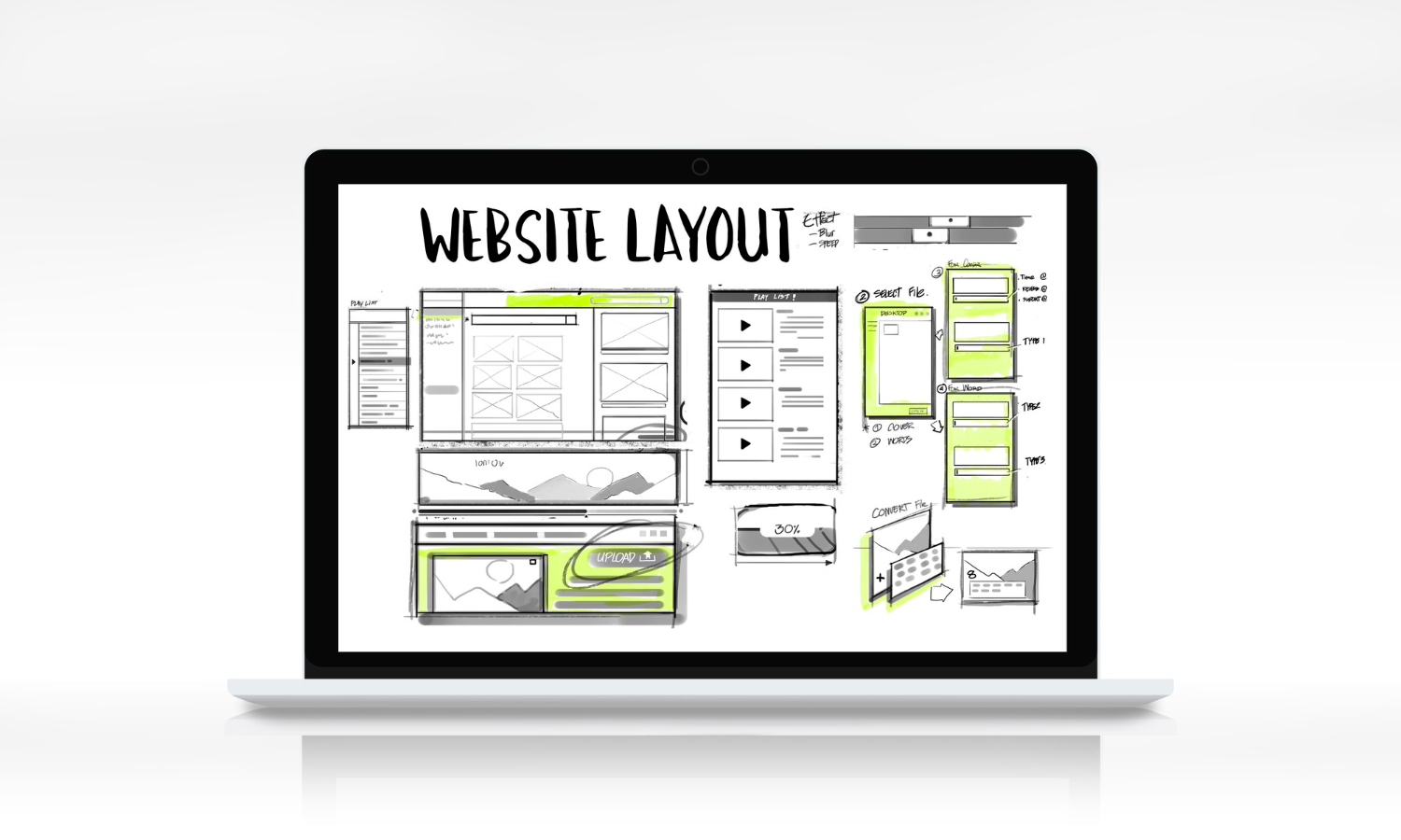
- Wireframing and User Journey Mapping: Wireframes were developed to visualize the new layout and structure of the website. User journey maps were created to outline the pathways each persona would take through the site, ensuring that the design met their specific needs.
- Content Audit and Strategy: A comprehensive audit of existing content was performed to identify gaps, redundancies, and opportunities for improvement. A content strategy was then developed to organize and present information in a way that was accessible and relevant to the target audiences.
Phase 2: Visual Design and Branding
With the groundwork laid in the prototyping phase, the next step was to bring the V PROSPER brand to life through visual design.
Key Visual and Branding Elements:
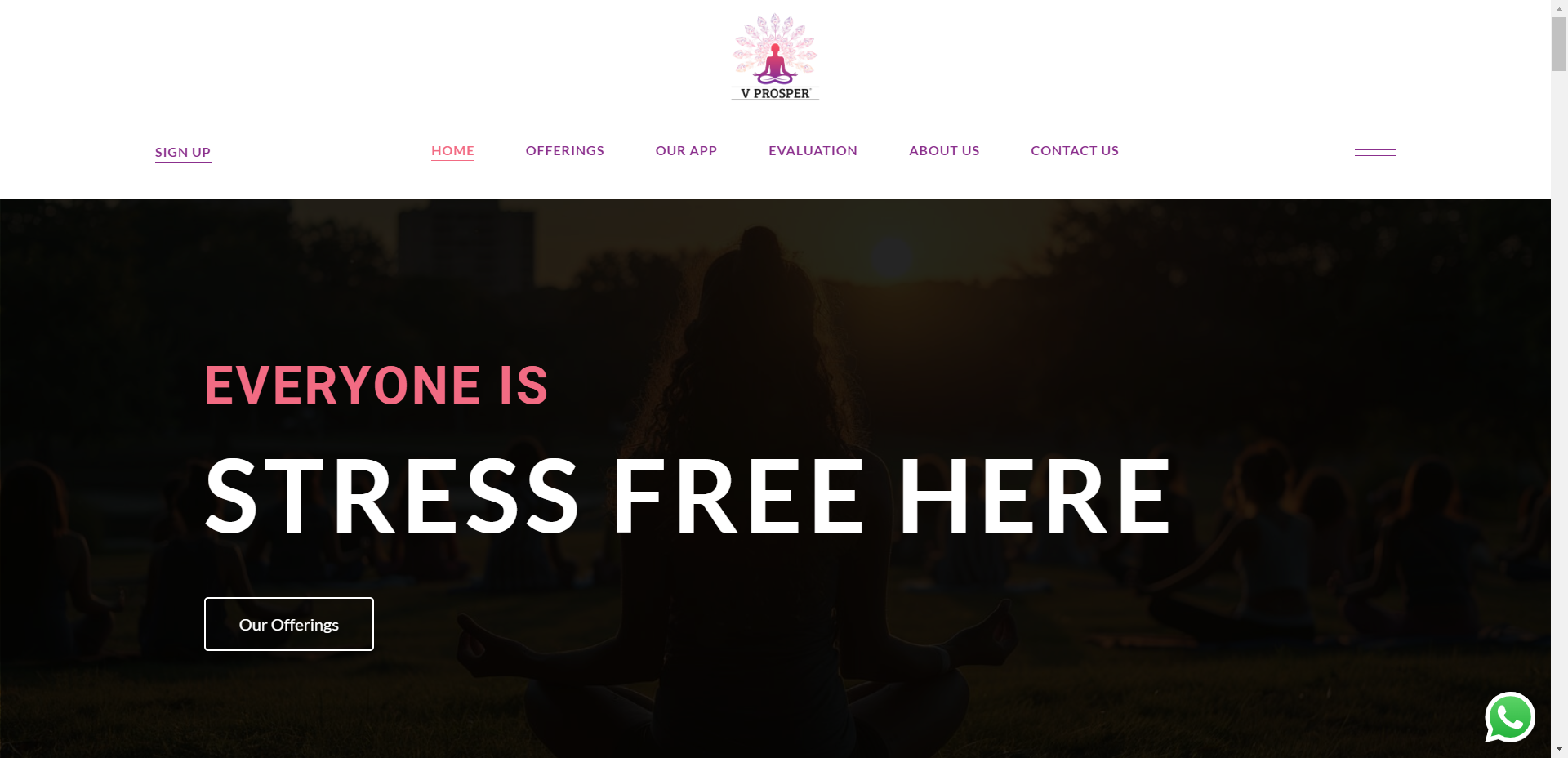
- Color Palette: The use of calming blues and greens was intentional, evoking feelings of tranquility, trust, and balance. These colors also aligned with the brand’s identity and the overall theme of wellness.
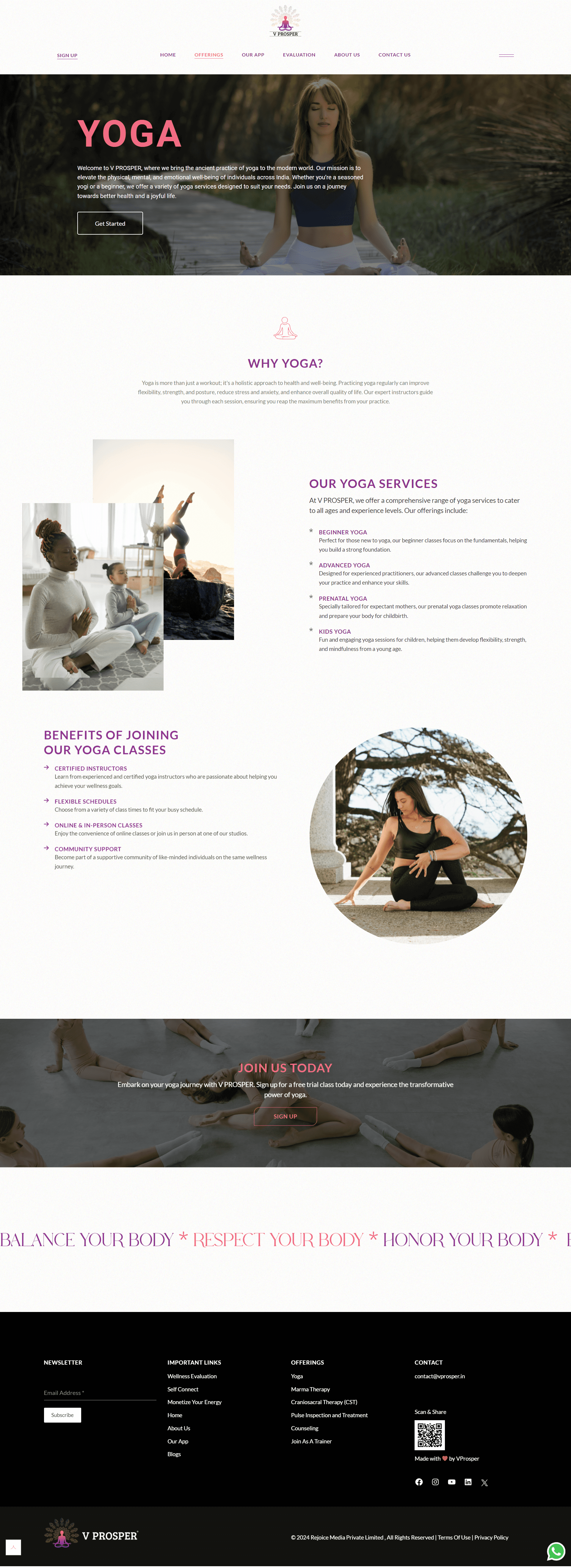
- Imagery: High-quality, professional images were selected to showcase a diverse and vibrant community of wellness trainers and users. These images were strategically placed to inspire and motivate users to engage with the platform’s offerings.
- Typography: A clean, modern typographic style was chosen to enhance readability across all devices. The fonts used were selected to convey a sense of professionalism while remaining approachable.
- Iconography and UI Elements: Custom icons were designed to guide users through the platform’s features, such as booking sessions or exploring personalized wellness plans. These icons were complemented by user interface elements that were intuitive and easy to interact with.

Phase 3: Development and Integration
The final phase focused on integrating the design elements with functional features to create a cohesive and user-friendly platform.
Key Features Implemented:
- Tiered Navigation System: A tiered main menu was introduced to clearly distinguish the different pathways for trainers and users. This system was supported by a robust footer menu, which provided additional navigation options for deeper content access.
- Responsive Design: The platform was designed to be fully responsive, ensuring that users had a seamless experience across all devices. This included optimizing the design for different screen sizes and resolutions.
- Booking and Personalization Features: A sophisticated booking system was implemented, allowing users to easily schedule wellness sessions with their preferred trainers. Additionally, the platform offered personalized wellness plans that adapted to individual user needs and preferences.
- SEO Optimization: Best practices in SEO were integrated into the site’s design and content strategy, improving the platform’s visibility in search engine results. This included optimizing metadata, alt tags, and implementing a clean URL structure.
- Analytics and Performance Monitoring: Tools were integrated to monitor user behavior, site performance, and conversions. This data was used to continuously optimize the user experience and make data-driven improvements.

Results and Impact
The redesigned V PROSPER platform has significantly enhanced the user experience by offering a more intuitive, visually appealing, and functional interface.
Key Outcomes:
- Improved User Engagement: The platform saw an increase in user engagement metrics, including session duration, interaction with wellness services, and repeat visits.
- Higher Conversion Rates: There was a noticeable improvement in conversion rates, with more users signing up for the platform and booking sessions with trainers.
- Enhanced Brand Perception: The alignment of visual design with V PROSPER’s brand values has strengthened its positioning as a leading wellness platform, attracting both trainers and users.
- SEO Performance: Organic traffic to the site increased due to improved search engine rankings, driven by the effective implementation of SEO strategies.
- Scalability: The platform’s responsive design and WordPress CMS support future scalability, allowing V PROSPER to easily expand its offerings and adapt to the evolving needs of its user base.
The successful redesign of the V PROSPER platform has not only met but exceeded the initial objectives, positioning it as a top choice for wellness professionals and users alike.

