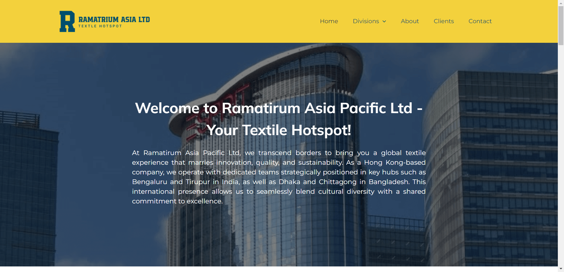
UI/UX Design Case Study: Ramatirum Asia Pacific Ltd
About Ramatirum Asia Pacific Ltd
Ramatirum Asia Pacific Ltd is a Hong Kong-based company operating in the textile industry with divisions in Garment, Fabric & Accessories, and Seed Funding Projects. With teams positioned in India and Bangladesh, the company sought to build a website that could seamlessly integrate their diverse operations and embody their global commitment to innovation, quality, and sustainability.

Objectives
- Develop a streamlined, accessible architecture for easy navigation across multiple divisions.
- Incorporate visual design that conveys both international reach and the company’s sustainability ethos.
- Highlight each division with unique landing pages tailored to distinct user needs, including potential business partners and investors.
- Boost organic SEO, improve brand recognition, and enhance user conversion.
- Implement a fully responsive site powered by WordPress CMS.
Phase 1: Prototyping
Ramatirum came to us with the need for a completely new website that would better represent their international presence. We began by mapping out a user journey, identifying key personas such as garment buyers, fabric traders, and seed fund investors. The goal was to ensure that the new site offered intuitive navigation, clear content pathways, and relevant resources for each division.
Our approach:
- Content Strategy: We introduced clear content segmentation, ensuring a well-organized experience for each audience.
- User-Centric Design: Prototyped interactive wireframes that prioritized seamless navigation across multiple pages.
- Navigation Simplification: Designed a main navigation menu and a secondary menu for easy division-specific content access.
Phase 2: Style
We drew inspiration from the company's diverse international presence to create a visually cohesive website:
- Color Palette: Blue Shades and Yellow were used to communicate trust, sustainability, and innovation. The green palette, in particular, reflects the company's focus on sustainability and the importance of quality textiles.
- Visual Storytelling: Featured vibrant imagery of the production process, capturing the dedication of Ramatirum's teams from different regions. Photos of workers, sustainable textile processes, and fabric samples enhance authenticity and brand value.
- Division-Specific Design: Each division's landing page carries distinct visual cues—garments are presented with fashion-focused imagery, while the fabric and accessories division highlights the texture and quality of materials.

Phase 3: Bringing It Together
To ensure an engaging and functional website experience:
- Tiered Navigation: A primary menu highlights the company’s divisions and Clients, while the footer provides quick access to core company details.
- Content Personalization: The website dynamically adjusts content recommendations based on the visitor's interest, guiding them to relevant pages such as product catalogs, investor reports, or sustainable practices.
- Mobile Optimization: The fully responsive design ensures that users from any device can access key information without compromising usability or visual impact.
Results and Impact
The new Ramatirum Asia Pacific Ltd website successfully bridges the company’s international operations, visually reflects its commitment to sustainability, and offers easy access for different user types. The site’s intuitive structure, coupled with a responsive, dynamic design, ensures a seamless and informative experience for visitors across the globe.
Website link: Ramatirum Asia Pacific Ltd


