UI/UX Design Case Study: KinectX
About KinectX
KinectX is a consultancy focused on organizational excellence through strategic human resource initiatives. We collaborated with KinectX to create a brand-new website that reflects its mission to enhance performance, cultivate talent, and drive a culture of growth and innovation. Our objective was to design a site that communicates their services and values clearly while offering an intuitive and visually appealing user experience.

Objectives
- Develop a clear and accessible information architecture to allow multiple audience segments to easily navigate and find relevant content.
- Design a user interface that aligns with KinectX's branding, promoting professionalism while driving engagement with the target audience.
- Integrate smooth, intuitive navigation features to help users explore services like Organizational Values & Culture, Leadership Excellence Program, and Research-Based Diagnostic Solutions.
- Improve SEO and increase organic traffic through a robust, responsive design backed by WordPress CMS.
- Develop a solution that positions KinectX as a trusted partner for organizations looking to drive leadership excellence and innovation.
Phase 1: Prototyping
The previous absence of a centralized online presence left KinectX’s services largely underrepresented. Our design team worked closely with KinectX to map out a new website that prioritized clean navigation and easily discoverable content for their key offerings.
The content needed better organization to highlight each service KinectX offers, while the design required a modern look that would cater to both HR professionals and executives. Wireframes were created to plan user flows, focusing on a homepage with immediate links to "Organizational Values & Culture," "Leadership Excellence Program," and other services, ensuring no user path felt cluttered or overwhelming.
Phase 2: Style & Visual Design
The visual design for KinectX is focused on professionalism with a modern twist. A combination of muted, professional colors with vibrant accent hues was selected to evoke trust, competence, and forward-thinking leadership.
- Main Color Scheme: Light and deep blues to reflect reliability and calm, paired with soft grays for a professional touch.
- Accent Colors: Shades of teal and orange to represent growth and innovation, offering balance while keeping the design dynamic.
- Visual Elements: High-quality images of leaders, consultants, and teams are used to bring a human aspect to KinectX’s mission. Icons and clean typography guide users through services with minimal friction.
These design choices support an easy-to-use, inclusive interface where each section feels distinct, but cohesive under the larger KinectX brand.

Phase 3: Bringing It Together
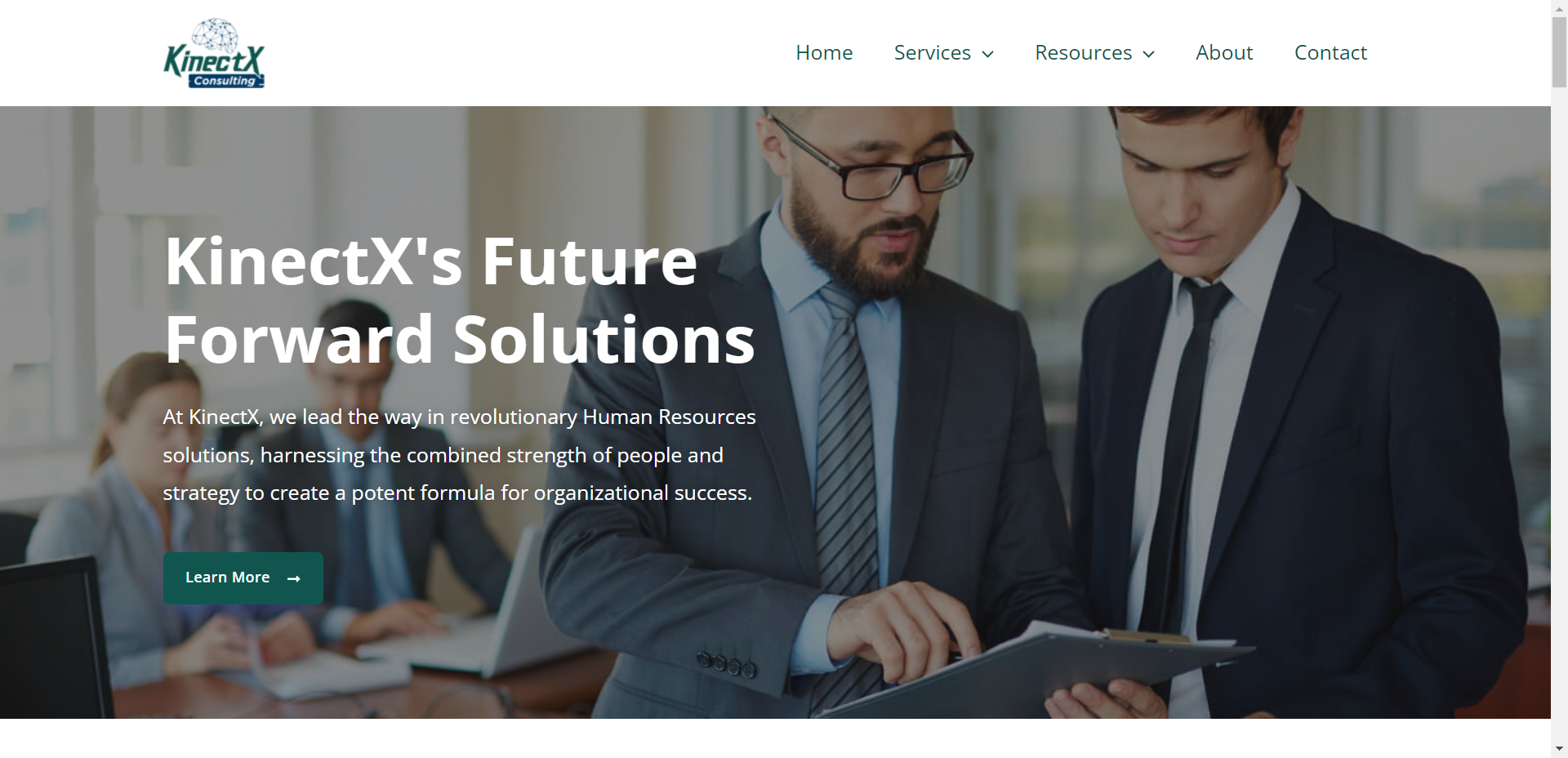
The final website features a straightforward navigation system, using a two-tiered menu that distinguishes KinectX’s key services. The main menu guides users to core offerings, while submenus allow for deeper exploration into each service category.
- Homepage: Users are greeted with a strong hero section that highlights KinectX’s mission and CTA buttons for key services, such as “Explore Our Services” and “Connect with Us.”
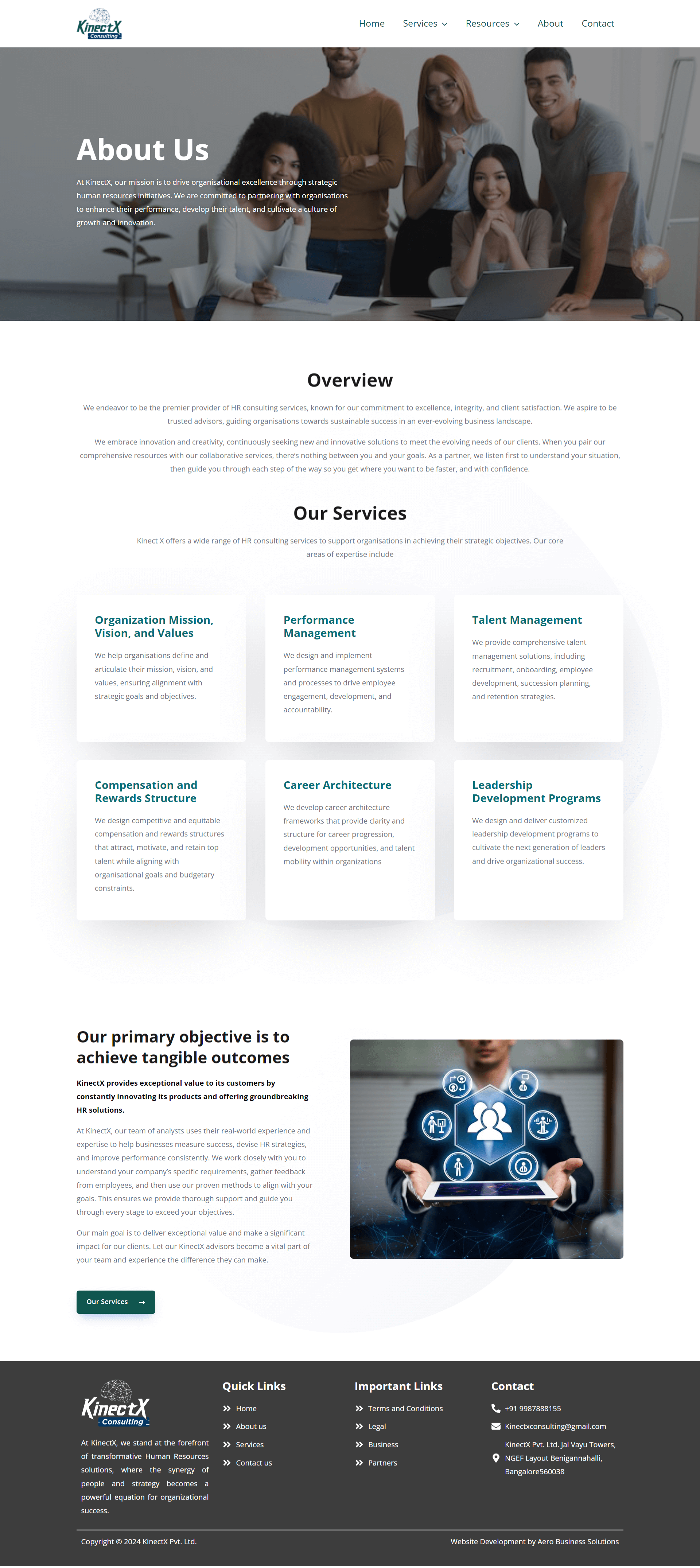
- Service Pages: Each service page is designed with ample white space, relevant visuals, and detailed descriptions to encourage easy comprehension and engagement.
- Footer Navigation: Includes quick links to all services, contact forms, and social media, providing multiple ways for users to interact with KinectX’s content.
Outcome
The new website successfully encapsulates KinectX’s commitment to organizational growth and leadership. With improved user navigation, responsive design, and clear visual branding, the site is now a powerful tool for increasing conversions, boosting organic traffic, and showcasing KinectX's leadership in HR solutions.
Visit the new site here: KinectX Website


