UI/UX Design Case Study: CyberProof
About CyberProof
CyberProof is a leading Australian cybersecurity firm specializing in protecting clients' reputations, minimizing downtime, and ensuring compliance across various industries. The goal of the project was to create a new website that reflects CyberProof's expertise and services while improving user experience and engagement.

Objectives
- Develop a Clear Information Architecture: Design a layout that allows users to easily access information about CyberProof’s services and expertise.
- Align Visual Elements with Brand Identity: Reflect the company's dedication to cybersecurity through a design that conveys trust and professionalism.
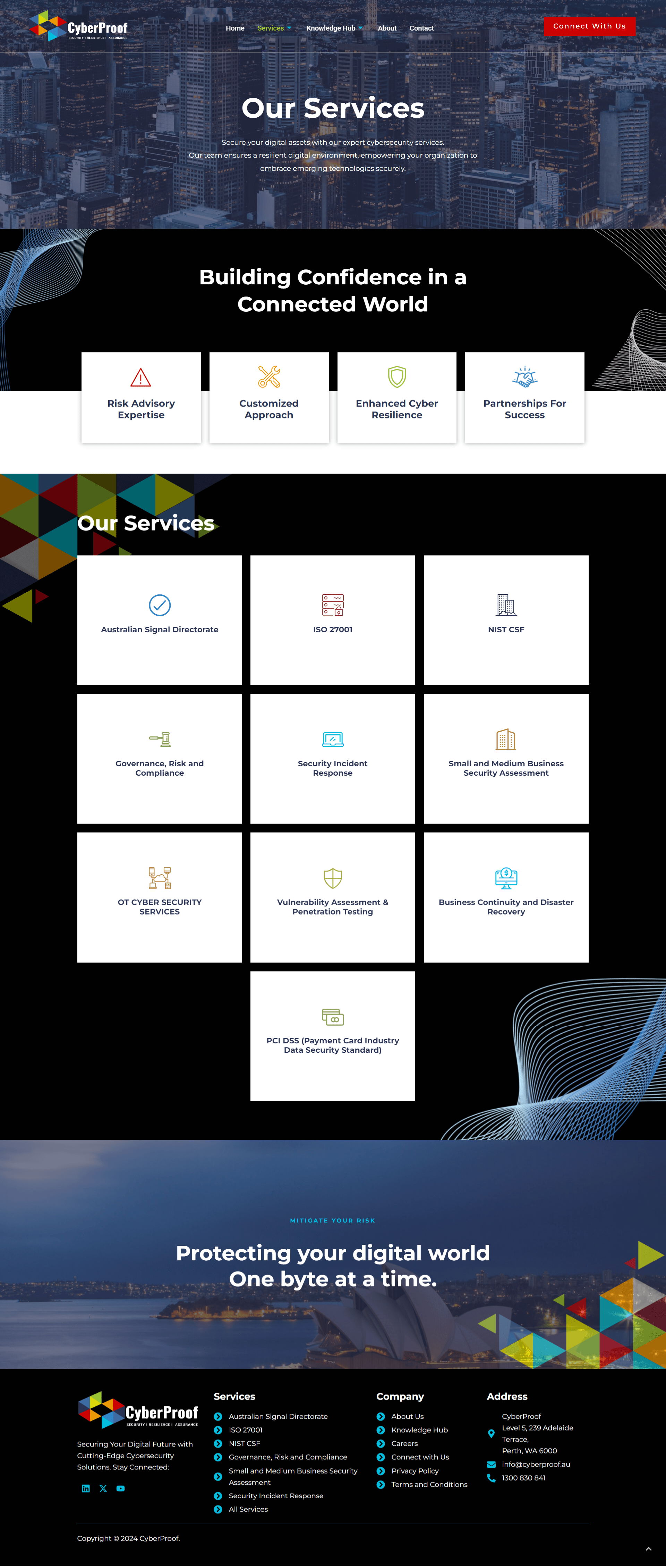
- Highlight Services and Expertise: Clearly present the range of services offered, with a focus on the unique aspects of CyberProof’s approach to cybersecurity.
- Enhance User Navigation: Create a user-friendly interface that facilitates quick access to important information and resources.
- Implement a Fully Responsive Design: Ensure the website functions seamlessly across all devices and screen sizes.
Phase 1: Prototyping
Challenges:
- The need to present complex cybersecurity services and industry-specific information in an accessible manner.
- Designing a layout that balances detailed technical content with user-friendly navigation.
Solutions:
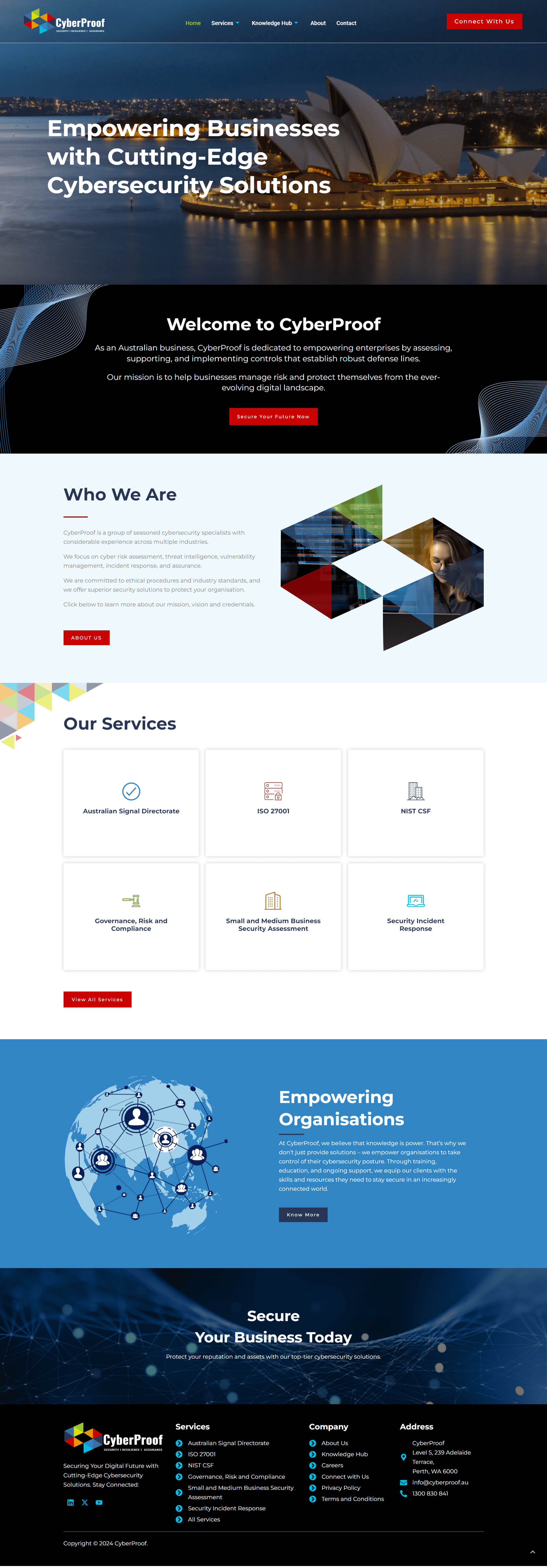
- Information Architecture: Developed a structured layout with clear categories and subcategories to guide users through CyberProof's services and expertise.
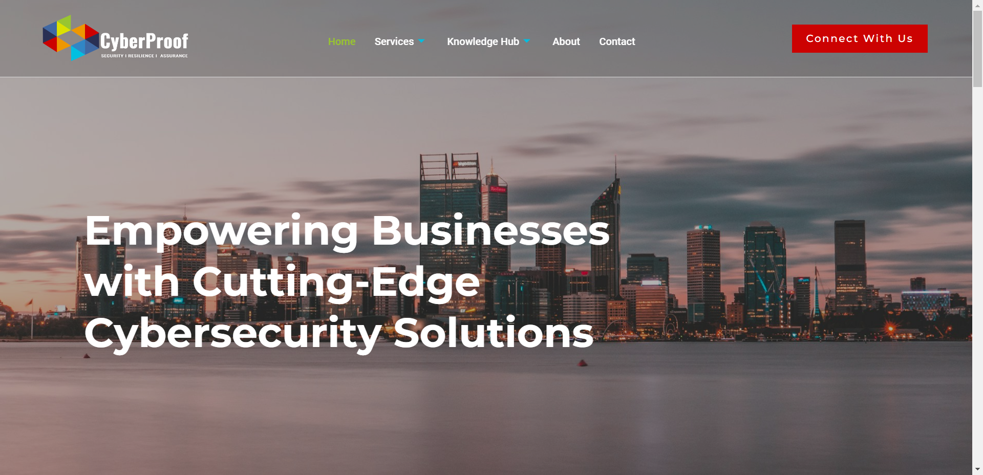
- Design Approach: Focused on a clean and modern design that emphasizes CyberProof’s professionalism and reliability. Included visual elements that convey a sense of security and technological advancement.

Phase 2: Style
Design Elements:
- Color Scheme: Used a professional palette of dark blues and greys to convey trust and security, with accents of vibrant colors to highlight key information and calls to action.
- Typography: Selected modern, readable fonts to enhance the clarity and professionalism of the content.
- Imagery: Incorporated high-quality images of technology and cybersecurity-related visuals, as well as team photos to humanize the brand.
Key Features:
- Service Sections: Created distinct sections for each service, including AR/VR Game Development, Computer Game Development, and Mobile Game Development, with detailed descriptions and case studies.
- Expertise Highlighting: Developed dedicated areas to showcase the team’s expertise, industry experience, and certifications.

Phase 3: Bringing It Together
Navigation and Usability:
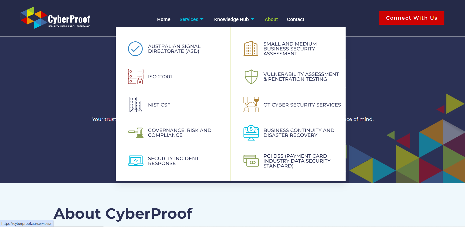
- Main Menu: Designed a tiered main menu that categorizes services and expertise, allowing users to quickly find relevant information.
- Footer Menu: Included a strong footer menu with additional navigation options and quick links to key pages.
- Call to Action: Placed prominent call-to-action buttons to encourage visitors to get in touch or request a consultation.
Additional Features:
- Responsive Design: Ensured that the website is fully responsive, providing a seamless experience across desktop, tablet, and mobile devices.
- SEO Optimization: Implemented SEO best practices to improve search engine rankings and visibility.
Results
- Improved User Experience: The new website design provides a clear, intuitive navigation experience, allowing users to easily access information about CyberProof’s services and expertise.
- Enhanced Brand Image: The professional design and use of modern visual elements reinforce CyberProof’s reputation as a leading cybersecurity provider.
- Increased Engagement: Clear calls to action and well-organized content have led to higher engagement rates and more inquiries from potential clients.

Conclusion
The new CyberProof website successfully meets the project’s objectives by delivering a clear, engaging, and user-friendly experience. The design aligns with CyberProof’s brand identity and effectively showcases their expertise and services, making it easier for clients to connect with the company and learn about their cybersecurity solutions.
Website Link: CyberProof


