UI/UX Design Case Study: Ambrosiac Studios
About Ambrosiac Studios
Ambrosiac Studios is at the forefront of gaming innovation, crafting groundbreaking experiences that resonate across platforms and realities. With a decade of expertise, they came to us with the need for a fresh, new website to showcase their boundary-pushing game development services and capture their unique creative essence.

Objectives
- Showcase Cutting-Edge Services: Highlight their expertise in AR/VR, computer, and mobile game development with engaging, interactive content.
- Enhance User Experience: Design a user-friendly interface that reflects the studio’s innovative spirit while making it easy for potential clients and partners to navigate.
- Boost Visual Impact: Utilize vibrant colors and dynamic visuals to create an immersive experience that mirrors the studio’s creativity.
- Improve Content Accessibility: Ensure all information about their services and projects is easily accessible, enhancing user engagement and conversion.
- Implement a Responsive Design: Develop a fully responsive site that looks and performs beautifully across all devices.
Phase 1: Prototyping
The challenge was to create a new website from scratch that would embody Ambrosiac Studios' pioneering spirit. The previous site lacked the interactive and immersive elements needed to reflect their innovative approach. Our goal was to build a site that not only presents their services in a compelling way but also engages users with a design that speaks to their cutting-edge capabilities.
The design process involved creating a structure that allowed for dynamic content presentation and interactive features. We focused on a layout that would showcase their work while making navigation intuitive and engaging.
Phase 2: Style
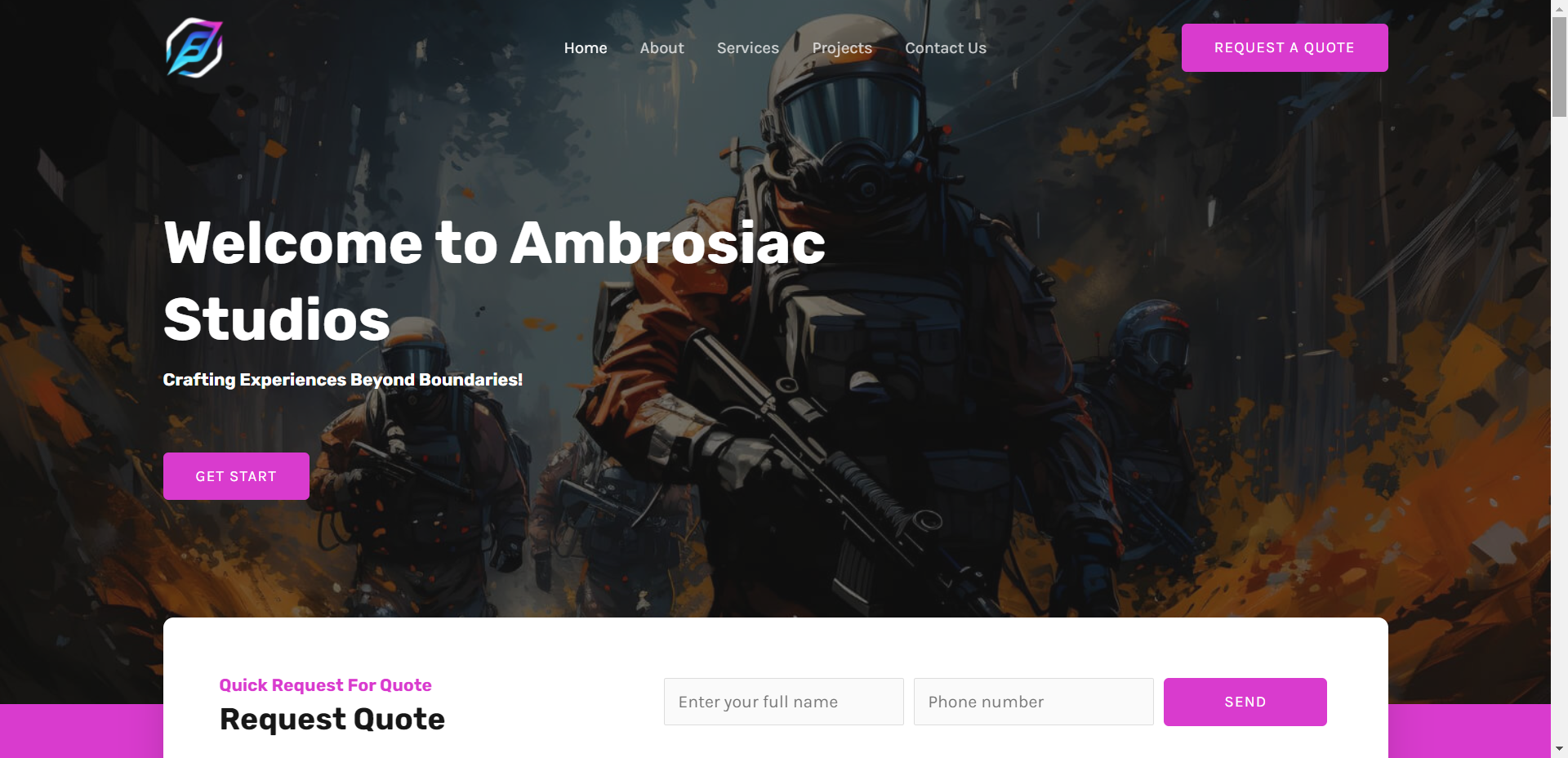
The visual design of the Ambrosiac Studios website is bold and vibrant, mirroring the studio’s commitment to pushing creative boundaries. The primary color, #D93BCE, is used to create an energetic and imaginative atmosphere, while complementary colors and dynamic visuals highlight their diverse services.
- Homepage: Features high-impact visuals and interactive elements that immediately capture the visitor’s attention.
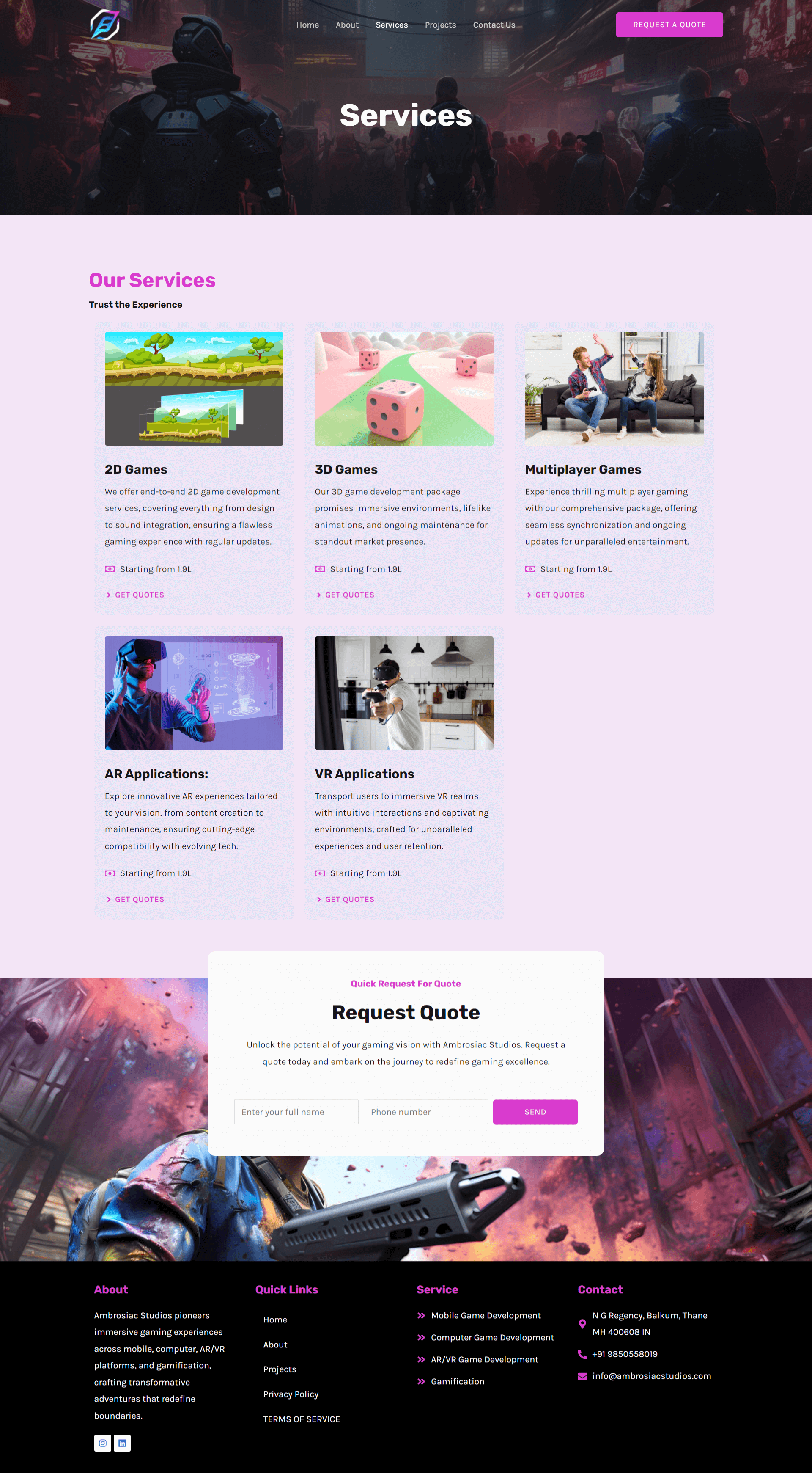
- Service Pages: Each service is presented with engaging visuals and detailed information, using a consistent color scheme to maintain a cohesive look and feel.
- Portfolio: Showcases their projects with rich imagery and interactive elements that reflect the immersive nature of their work.

Phase 3: Bringing It All Together
The final design features intuitive navigation, eye-catching visuals, and bold, creative storytelling. A dynamic, multi-tiered navigation system helps users explore Ambrosiac’s full service offering with ease. The new layout is structured in a way that immerses visitors in the creative process behind game development while keeping focus on the services.
Notable Features:
- Service Pages: Each service page (AR/VR, mobile, and computer game development) is crafted with immersive visuals and engaging copy that invites users to explore Ambrosiac’s groundbreaking projects.
- Responsive Design: The site’s design is fully responsive, offering users an optimized experience on both mobile and desktop platforms. Key services are always easy to locate, regardless of the device.
- Bold CTAs: Strategic placement of calls-to-action (CTAs) like "Explore Our Services" and "Join Us" drives users to engage with the site further, encouraging exploration and interaction.
Conclusion
The new Ambrosiac Studios website successfully communicates the brand’s dynamic spirit and innovative edge. Through clean navigation, a bold color palette, and immersive visuals, the website not only reflects the brand but also serves as a key driver of engagement, effectively showcasing their services to both new and existing audiences.
Visit Ambrosiac Studios’ website: Ambrosiac Studios


